For project 1 I am going to do the YCN awards brief for Bear Cereal Packaging design.
I downloaded the project pack online which came with the brief, templates and previous designs.
The deadline for this is 27th March.
Taken from the project pack:
Background
Ever since we launched BEAR, we’ve wanted to make cereal. We felt that nature might have a better alternative to the sugary, salty cereals that were out there already, and so went foraging. Our new BEAR Alphabites are made from six natural ingredients with no refined sugar or salt, and most importantly they taste grrreat.
When we were designing our cereal, we decided that we wanted to create a product that wasn’t just healthy (ticking the boxes for Mums), but also really fun (ticking the box for kids). So we created our cereal letters because we hoped that it would bring a bit of fun to the breakfast table. Letters also did a very nice job of helping kids to learn without them realising that they were doing so, which is something that underpins everything we do. We wanted to approach this in a fun, not scholarly way, as we’ve always found kids learn best when they are finding out something, which doesn’t feel like they’re learning.
In June we launched cereal with eight back of packs that each took a letter theme- e.g. S is for space, I is for Insects and so on - the idea being that each pack would transport kids off into a wonderful new world, jam packed full of facts. With each pack we wanted to bring the letter theme to life, to teach kids something new, and to provide content that would last a good few breakfast sittings. Cereal back of packs on the whole are (dare we say it) a little bit lazy - games that take 2 minutes to complete, or back of packs that speak to parents not kids - and we wanted to give kids a little bit more than that.
The packs have gone down really well with consumers, and we get feedback from parents saying that the kids are reading them religiously and repeatedly. As we get ready to do our next packaging refresh, we feel that we could make the alphabet theme become more focal. Each letter needs to be the hero on the pack. How could you help us make it become a clearer, stronger idea where kids cant wait to find the next letter in the alphabet? We want them to feel excited about finding all 26, and the icing on the cake would be to think of a reason to want to collect them all, something which replaces the need to put toys or other trinkets in the box.
The Creative Challenge
We want you to bring the alphabet to life on the back of our Alphabites boxes. We hope this will appeal to graphic designers and illustrators, but how you approach this is up to you. You might continue the idea of celebrating and editorialising ‘one letter per box’ or you might have ideas that bring in one or more letters at a time. What will the back of your box/boxes look like? How will the content inspire and engage kids? How will you build excitement among kids, and anticipation for future boxes. Will boxes look the same stylistically or will you propose variation from one box to the next?
You might want to focus on helping us do what we’re already doing better, or taking a step back and looking at the Alphabet creatively from a different viewpoint.
Creative Requirements
In the Project Pack you’ll find some examples of our current eight pack backs, along with the their dimensions. We’d like you to produce new back of pack designs in line with information above. You can produce as many designs as you see fit to demonstrate your thinking.
What a great result would look like:
It’d be really bold, brave, gruff, simple and fun.
It would be iconic.
It would really make the alphabet letter the hero on pack.
It would be really educational or crafty in a non-scholarly way and fun for kids, helping them to learn without realising that they were doing so.
It won’t talk down to kids and ideally would thrill and entertain adults too.
It would be enjoyed more for more than one breakfast sitting- kids spend a lot of time reading the back of boxes over the course of a week, how can we keep them entertained?
It would mark us out as being a brand that really loves its consumers.
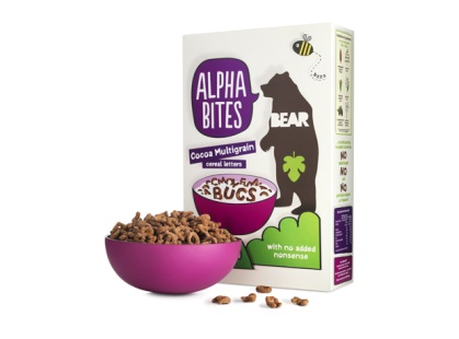
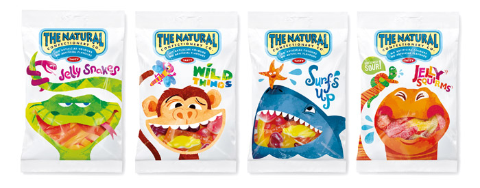
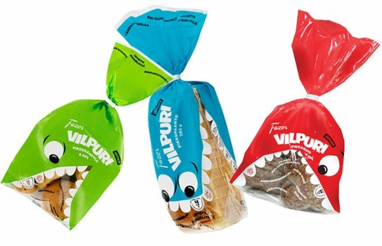
I looked into the branding and design of Bear products
Front of Alphabites cereal box
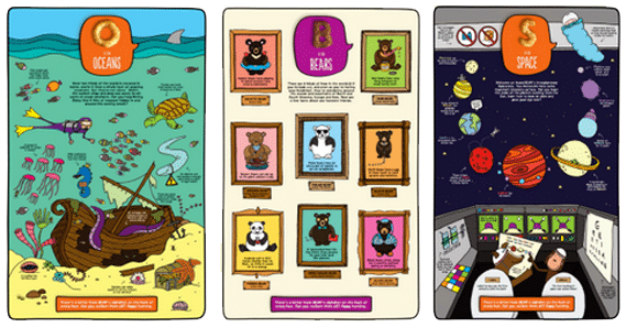
Previous illustrated backs
Advertisement
Full design of cereal box
Bear Nibbles