Overall I enjoyed this module as it taught me how to work quickly and produce whole projects in short time frames. I worked in ways I don't usually take to and learnt new things about my work as an illustrator. It has let my style develop and become adaptable to different kinds of briefs and ways of working. I have become more comfortable in trying new things and developing my work and ideas into something new. Some of the workshops I really enjoyed and have gave me inspiration for doing things in the future and some of them I didn't enjoy as much taught me how to be flexible with my illustrations, such as work shop 2 with the patterned fish, I worked in a different way and I really like the outcome, and workshop 5 witch portraits I never thought I could do a portrait as I do not draw realistically but it made me see how I can adapt things to suit me and I really enjoyed working on it and developing it.
In what way have you selected and developed projects that are relevant to you?
I selected 3 projects to work on to develop, spiritual chickens, witch portraits and my chosen story.
I really enjoyed created the illustration to go with the poem for spiritual chickens, I liked the characters I had created and the style of the chickens so wanted to make a set of illustrations of little chickens as I like to illustrate animals and I thought the chicken designs made a nice pattern and design to be printed on things like table cloths, cushions, ect which is something I would like to do with my illustrations in the future.
Initially I wasn't keen on illustrating a portrait but once I got into it i really enjoyed it. I wanted to create a sense of character in my portrait without having any visual references so developed the idea of the bear being his spirit animal was something I really wanted to do. I enjoy making characters and telling a story through them so this became a very relevant piece to me.
My chosen story was something I had always wanted to do as it is a story that I really love and I think it has an important message within it. As I love designing characters illustrating all the wild things was something I was really interested in doing.
How succesfully have a full range of possible ideas been explored?
I think I explored as much range of ideas I could within the time frame we were given for these projects. If I had more time and more money I would of really liked to have some of my designs printed onto products like my little chickens printed onto cushions and things and I would of liked to have made a really big strip of my wild things panels to be put on a wall or something but at the moment I felt like these things are not really possible.
What issues have had either a positive or negative effect on the realisation of your ideas?
I felt like some of the restrictions on the brief were difficult to deal with such as colour limitations and sizes and initially these had a negative effect on my ideas but once I learnt how to work with them and adapt my ideas it became something I liked to work around as it was more of a challenge and made me work and think in new ways.
Consider your outcomes for the module and evaluate them in response to your intentions as stated in your ad31 mini statement:
I can't really remember what I put on my statement but I know that my ideas developed and changed while working on the projects so I have probably ended up with different outcomes to what I originally thought but I think this is a good thing because while working on things I sometimes think of better ways to do things or better ideas so it makes a better outcome.
Tuesday, 12 November 2013
Workshop 6 - Development and Outcomes
'Where The Wild Things Are'
For this workshop I thought it would be difficult to fit a story into only 3 panels as a beginning, middle and end but discovered that my story fit really well into 3 sections so decided to stick to this layout in my development work too.


For this workshop I thought it would be difficult to fit a story into only 3 panels as a beginning, middle and end but discovered that my story fit really well into 3 sections so decided to stick to this layout in my development work too.


Original 3 panels in black ink from workshop.
To develop the panels I painted them in watercolours and added some hand drawn text.


The original watercolour paintings.

as a full strip.

With the text added.
I also developed the project by making a set of little prints of the characters and quotes from the book. Painted with watercolours with hand written text.


Workshop 5 - Development and Outcomes
For this project I was given a witch that I could find very little information on and no visual references at all so I had to use a bit of imagination based on what I found to create this portrait.

To develop this project I wanted to rework my portrait into something a bit closer to my usual style and materials I use and create a cleaner more developed image. I thought about creating a full page illustration instead of just a a5 portrait because portraits are something I don't usually like to do but I decided to stick with it to be more of a challenge. I redrew the portrait and added the shadow of a bear behind him to make it look like his character could turn into a bear to do his witchcraft.


I read that some of the accused witches used animals to carry out their spells and curses and that the devil sometimes appeared to them in the form of an animal. Based on this information I came up with the idea of using animals in my illustration to tell a bit of a story with this vague character. This is the image I made during the day of the workshop it is a collage of different papers painted over with inks which is very different from the way I usually work but I wanted to try something new during the workshop.
To develop this project I wanted to rework my portrait into something a bit closer to my usual style and materials I use and create a cleaner more developed image. I thought about creating a full page illustration instead of just a a5 portrait because portraits are something I don't usually like to do but I decided to stick with it to be more of a challenge. I redrew the portrait and added the shadow of a bear behind him to make it look like his character could turn into a bear to do his witchcraft.

I then painted over the pencil drawing to create a coloured portrait. I liked this outcome but thought there was a bit too much negative space that I could work with and that the bear didn't look sinister enough to fit the story.

I developed the character again to a have a larger darker looking shadow bear behind him more like in my first outcome I did in the workshop and added in some rain pattern in the background.

I then scanned this image in and worked on it in photoshop to create this final outcome. I think it combines the best bits of both other illustrations I did.

Workshop 4 - Outcomes
I had 2 different ideas for this workshop, the first being of King James fighting against a smoke demon with a sword against a cigarette, or my other idea was in relation to the term stygian and was of the 3 witches. I did designs of both ideas to see what would work best.

Although I liked this design of the 3 witches and liked the way the text sat in the image I didn't think it visually represented the quote enough.

I reworked into the illustration digitally to include some of the things said in the quote adding an eye, brain and lungs to the witches to symbolise it was harmful to the brain and lungs as it said in the text but I
didn't really like the outcome of this.

I decided to use my original idea of King James fighting the good fight against tobacco because I thought it was more of a visual representation of the quote and suited it better. I also really like the white text on the black smoke bubble as it makes it stand out more. I didn't change much from my sketchbook image I only had to scan it in to clean the edges to make this into my final piece.
Workshop 3 - Development and Outcomes
Spiritual Chickens was one of my favourite workshops which I chose to develop in stage 2.


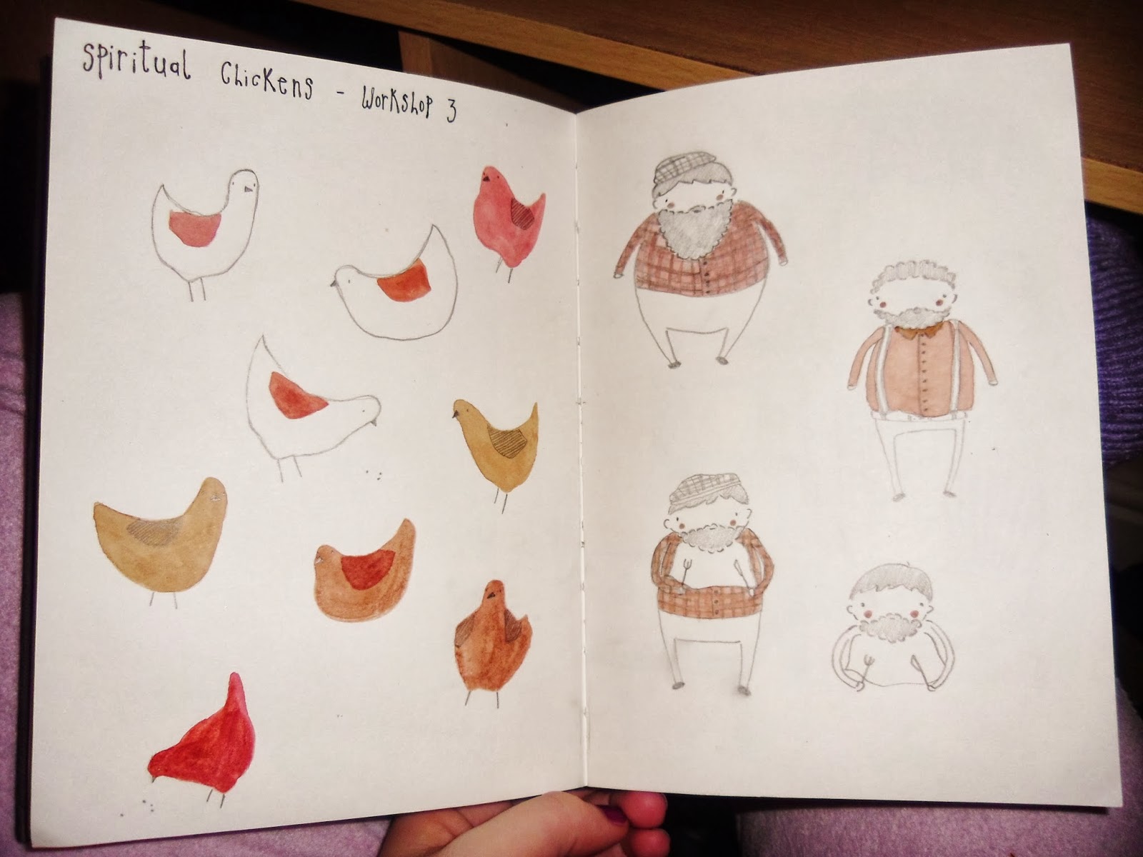
I started my designing my little chickens and character to go with the poem by Stephen Dobyns, and choosing a colour scheme of warm colours like reds and browns.

I created the look of a country style farmhouse by using bits of furniture and kitchen tables and chairs and decided to add in a bit of blue to the colour scheme to liven it up a bit.

This is the final illustration I made to go with the poem.

The image within the template.
From here I decided to develop this project into a series of little prints and postcards of chickens. I painted all the chickens with watercolours and hand wrote the text. Most of them are a6 size apart from the last image which is a4 size. I have digital copies of all the paintings so I can make them into prints when I need to.


Workshop 2 - Outcomes
For this workshop I created a pattern of red and white koi fish with one koi fish that has black spots as the element of suprise. I wanted to do something more traditional in terms of style for this illustration to try something new and go out of my usual style of work. I created a small area of pattern using fineliner and watercolours which can be made into a larger pattern by replicating it digitally as shown here :


Original Pattern.

Pattern duplicated into larger piece.
Workshop 1 - Outcomes
For the first workshop I played around with lots of different ideas of shelter and came down to 2 ideas, umbrellas and birdhouses. These are the black and white illustrations I did using ink and fineliner pens :


I decided to use the girl with the umbrella illustration as my final piece.
Pylon Press Cover

Design for 3 colour risoprint, blue, florescent orange and black.
Terrible Yellow Eyes
Terrible Yellow Eyes is a collection of works inspired by the beloved classic, Where the Wild Things Are by Maurice Sendak. It was great to have a wide and varied collection of work to look at while doing this project. I found that most illustrations didn't vary much in terms of character design, the wild things were kept mostly the same as Maurice Sendak's original characters with little change, this suprised me as the main thing I wanted to do was create my own interpretations of the wild things to reimagine the story. Here are some samples i liked from the website.
Alberto Cerriteno. The detail in this image and the background creates a busy active environment and gives your eyes alot to look at keeping the image interesting.

Luisa Uribe. I love the softness and delicate lines and colours in this illustration.

Ben Mounsey. This image is more dark and a bit sinister in contrast to most others. The choice of a red colour palette is unusual and would be interesting to see how it would work as a full picture book.

Lars Henkel. A very cool pen sketchbook drawing of one of the wild things.

Jacob Souva. I like the textures used in this illustration and the use of text within the image.

Matthew Armstrong. I love the wild things eyes in this illustration they really catch your attention and draw you in.

Bobby Pontillas. This illustration is done in a very soft style and colours making it more appealing to a younger audience.

Jared Chapman. I like the style of this illustration and the little triangular trees.
Alberto Cerriteno. The detail in this image and the background creates a busy active environment and gives your eyes alot to look at keeping the image interesting.
Luisa Uribe. I love the softness and delicate lines and colours in this illustration.
Ben Mounsey. This image is more dark and a bit sinister in contrast to most others. The choice of a red colour palette is unusual and would be interesting to see how it would work as a full picture book.
Lars Henkel. A very cool pen sketchbook drawing of one of the wild things.
Jacob Souva. I like the textures used in this illustration and the use of text within the image.
Matthew Armstrong. I love the wild things eyes in this illustration they really catch your attention and draw you in.
Bobby Pontillas. This illustration is done in a very soft style and colours making it more appealing to a younger audience.
Jared Chapman. I like the style of this illustration and the little triangular trees.
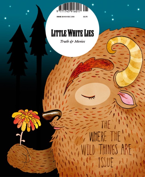
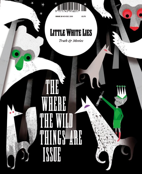
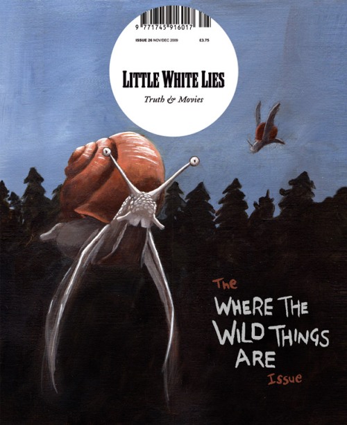
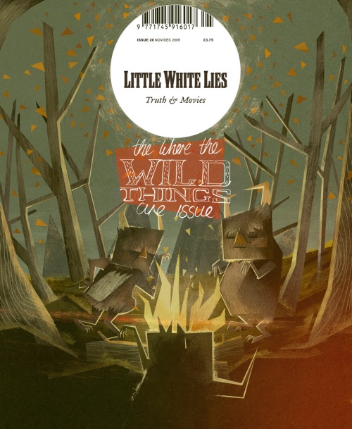
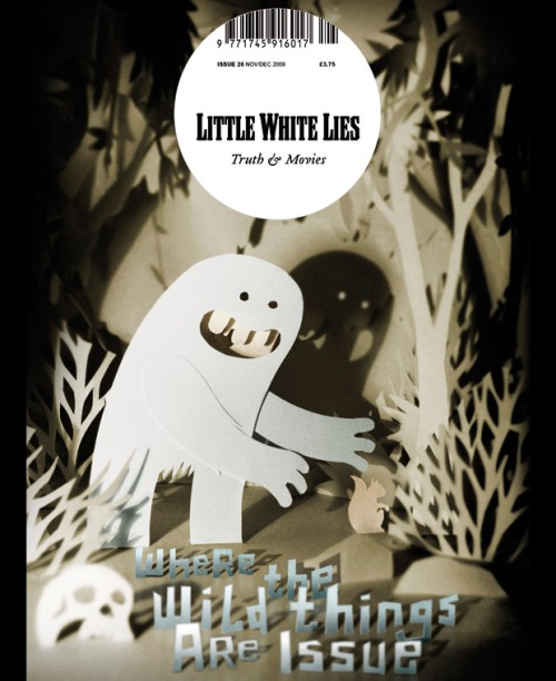
Magazine cover illustrations
Little White Lies magazine hosted a competition for the cover design of their where the wild things are issue, here are some of the entries. I like how they are so different to the original illustrations and are more contemporary.
Emily Twomey
Lesley Barnes
Ben Mills
Matthew Lyons
Slendidhand
Wednesday, 6 November 2013
Where the Wild Things are - research
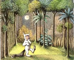
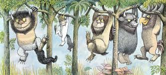
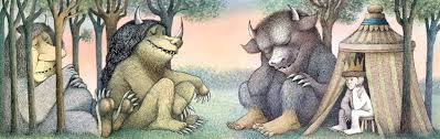
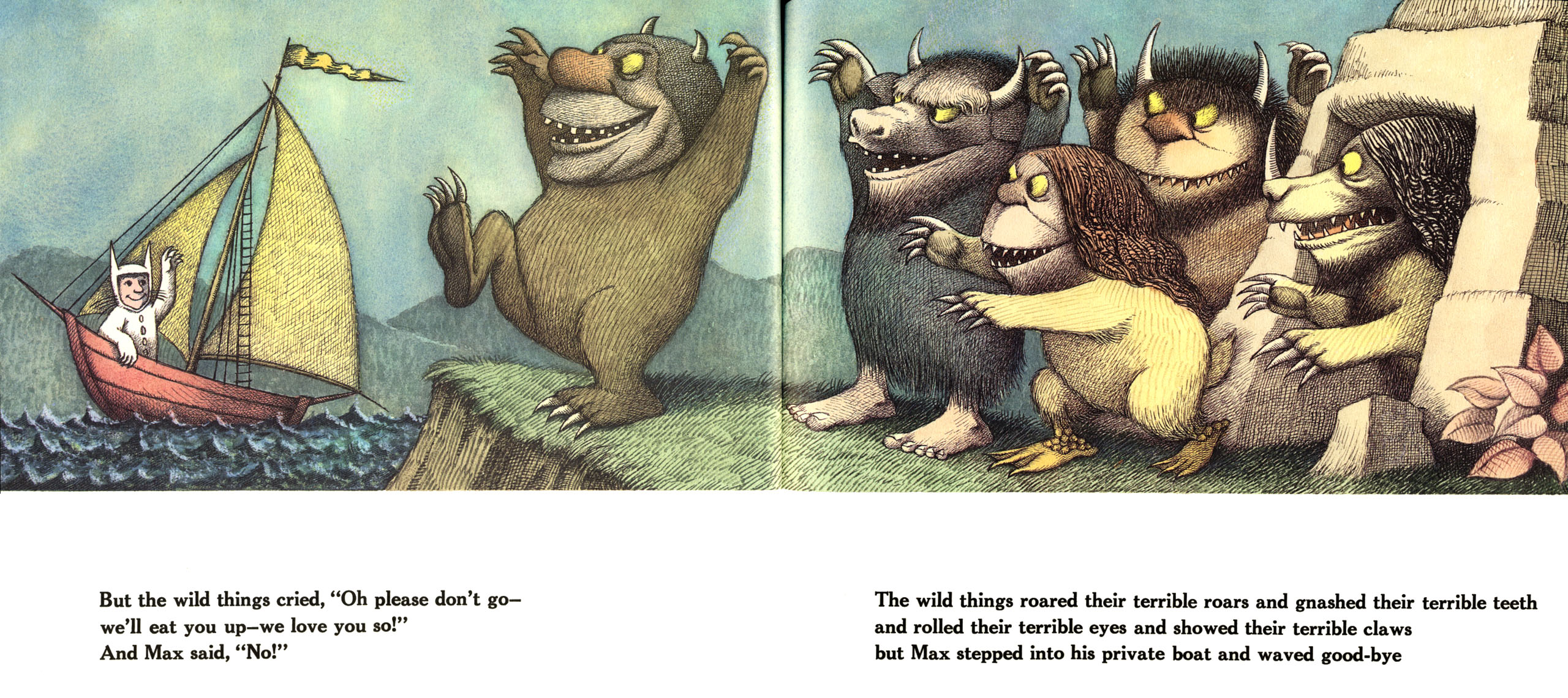
Some original images from the book 'Where the Wild Things are' written and illustrated by Maurice Sendak.
I think his style of illustration is quite traditional in the way he uses scratchy black ink lines and quite muted colours. I wanted my illustration to be more contemparary and simple with less detail in the linework and the characters less realistic than the origionals.


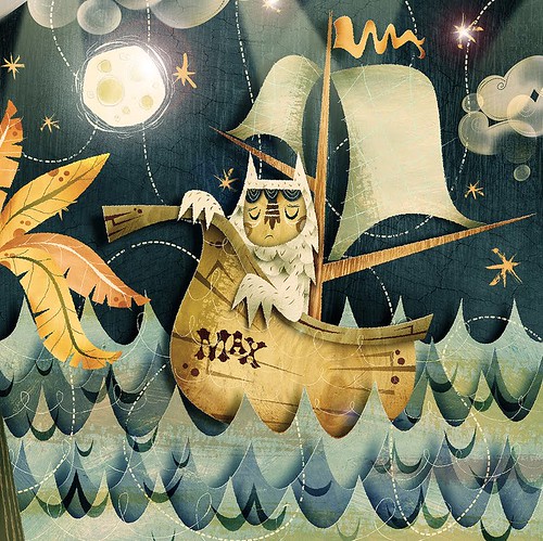
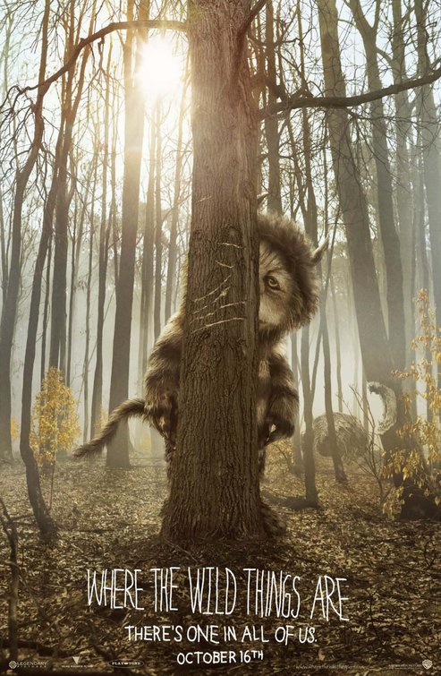
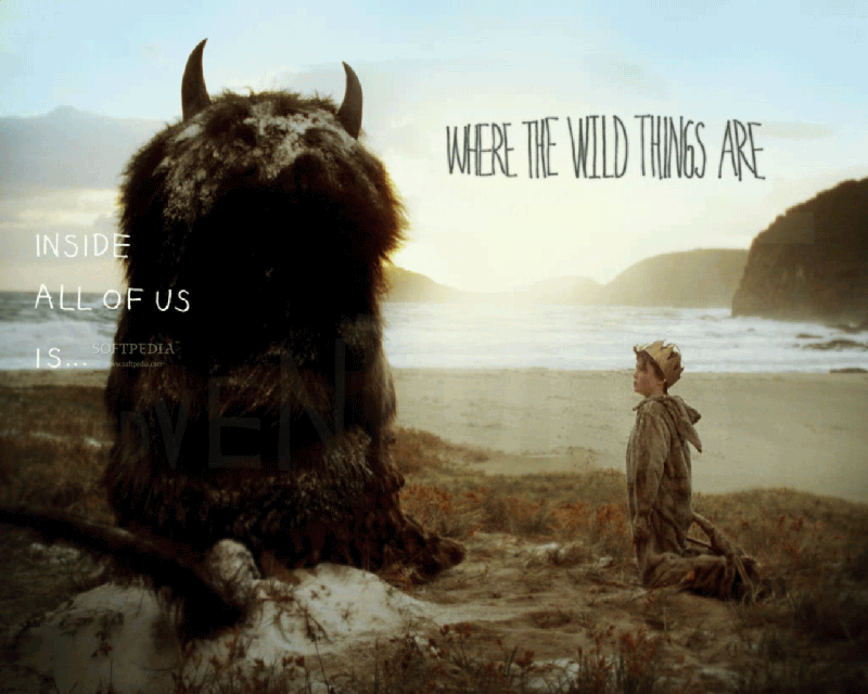
There was a film based on Where the Wild Things are in 2009 directed by Spike Jonze. I really loved the style of the film and characters.
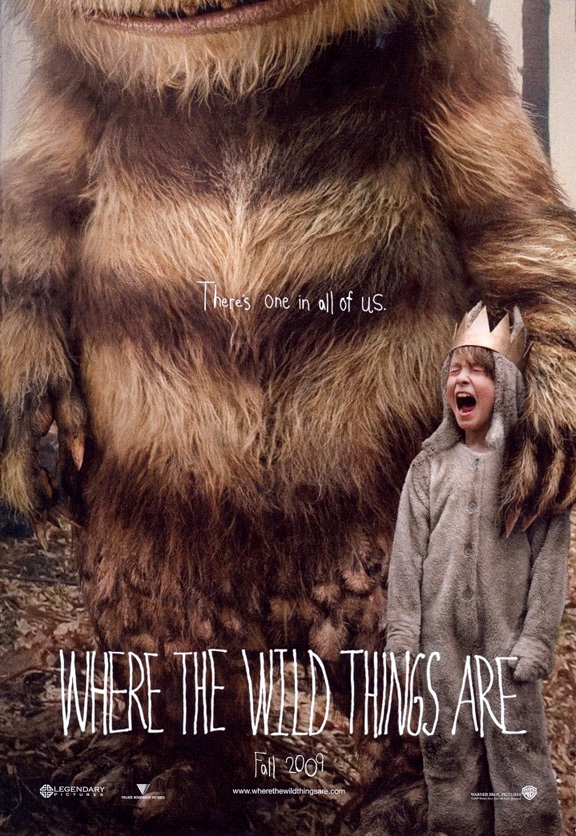
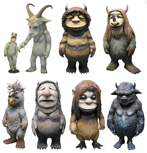
Character Designs as in the film.
I think his style of illustration is quite traditional in the way he uses scratchy black ink lines and quite muted colours. I wanted my illustration to be more contemparary and simple with less detail in the linework and the characters less realistic than the origionals.
There was a film based on Where the Wild Things are in 2009 directed by Spike Jonze. I really loved the style of the film and characters.
Character Designs as in the film.
Subscribe to:
Posts (Atom)