Student at Plymouth College of Art, Blog for my work and research.

Monday, 27 January 2014

Research - Agents/Publishers

I looked into agencies and publishers that i could possibly send my work to and found out how to contact them and send submissions of my work and what process is required to go through. I mostly looked into children's book publishers and agencies as this is an area i hope to go into when i graduate.

Bright Agency
Bright is an agency for children's book illustrators, they have a really wide variety of styles and illustrators that go across the range from young childrens picture books to educational, typography, black and white and many others.

Taken from Bright's website
"We have always been recognised for our role in developing illustrators and have discovered and launched the careers of some of the best unpublished artists to hit the scene in recent years.

As agents, we see it as our responsibility to give help, encouragement and direction to our artists and the Bright Group exists to do just that. We influence and encourage our artists on the direction of their careers – helping them to tailor their work to the needs of the market, without losing touch with their creative personality.

Above all, we listen to our artists – some desperately want to be trade picture artists, others are financially driven or solely work on decorative/stationary books, whereas some just want to draw dragons! Whatever direction our artists want to take we work tirelessly to help them achieve their aims and find the right work from the right clients. If this means working directly with them to create the perfect portfolio pieces to win a particular commission, then our in-house art director is on hand to help.

The Bright Group is also available to help established artists looking for a change in direction – many artists who have already enjoyed a successful career may look to follow a different creative path and when that happens, we are right behind them. We have resurrected big name artists and re-launched them with new styles and pseudo-names. We have been able to triple the income of established professionals by seizing opportunities that may exist outside that artist’s main creative channel. For example, we have helped a stationery artist move into decorative gift books, and moved a top picture-book artist into children’s packaging and clothing ranges.

Whether you are just starting out, or are at the peak of your career, the Bright Group is here to help and guide you. We work with and for our artists and that’s why we have been able to deliver the most creative results in artist representation that the children’s market has seen in recent years."

There submission process is quite simple and easy all you have to do is send a collection of 10-12 images of your work to be considered for representation.

Artist Submissions

We are a busy agency and therefore receive hundreds of submissions each week. We love receiving artwork and will be happy to look at your samples but it is crucial that you follow our guidelines below.
If you are a talented artist looking for representation please send us 10 – 12 low res jpeg samples attached to submissions@thebrightagency.com We do not accept any other file formats or zipped file attachments. We regret that we cannot look at external websites.
This agency is based in London and submitting my own portfolio is something i will be interested in doing in the future.

Beehive Illustration Agency
Beehive is a uk agency representing children's illustrators. They have a great opportunity for illustration graduates to showcase their work on their website.

I think this is a great way to get your work out there and be seen by potential clients.

Walker Books
Walker is a publisher of children's book that range from young children's picture books to teenage fiction, they represent both authors and illustrators. Walker accept submissions of illustrated picture book to be considered for publication, the submission process is on their website.
How do I submit a manuscript/illustrate books for you?
While we do not accept fiction manuscript submissions, we are happy to accept illustrated picture-book stories and/or artwork samples via post or email.
POSTED SUBMISSIONS
ILLUSTRATED PICTURE-BOOK STORIES: Please send an illustrated dummy and/or a typed manuscript. 
ILLUSTRATION SAMPLES: Please send eight to ten colour samples or a CD showing your work.
These should be accompanied by a stamped, self-addressed envelope for us to return your material to you if we decide not to pursue it.  Material received without the appropriate SAE will be recycled.  Please note, we can no longer return any material sent from outside the UK, even with international response postage coupons.
Please do not send original artwork or dummies, only copies, as Walker Books cannot accept liability for loss of or damage to material submitted. 
We regret that we are unable to enter into any correspondence about submissions or discuss them on the telephone.  As we receive a large number of submissions in the post each week, please allow up to three months for us to respond.  We appreciate your understanding in this matter.
Please send your dummy/samples to:
Illustrator Submissions
The Art Department
Walker Books Ltd
87 Vauxhall Walk
London
SE11 5HJ
EMAIL SUBMISSIONS
Illustrated picture-book stories or illustration samples should be sent as a jpeg or PDF for images (5 MB size limit) and as a Word document for text.  Unfortunately we are unable to reply to email submissions unless we are interested in your work.
Please send email submissions to: illustratorsubmissions@walker.co.uk
For further information and advice, we suggest you check the following websites: http://www.writersadvice.co.uk;http://www.writersandartists.co.uk/

Walker also offer work expierience placements in their company, which i think is a great opportunity to see how a big publishing company works, available placements are advertised on the website and you apply by email to be considered.

Research - 3 Artists

I have looked into 3 different artists/illustrators that i aspire to and work in similar ways to me. I looked into their work and things they have published aswell as reading interviews and information about how they work and how they got to the point in their career they are at today.

Oliver Jeffers
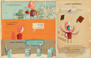
He is one of my favourite illustrators in terms of style and character design. He writes his own stories that he illustrates himself which is something i would like to do in the future. He uses a mixture of media from watercolour and acrylics to collage. He has a comtemporary style and uses compostition and space to create his visually appealing illustrations. He also uses handwritten text in his work which is something i enjoy using in my own work.


The Great Paper Caper


Stuck


The Incredible Book Eating Boy

 http://www.todaysparent.com/family/activities/interview-with-author-oliver-jeffers/

I found this interview with Oliver Jeffers where he explains how his writing and illustrating process work  "They both happen at the same time. I kind of develop them simultaneously because they have to support each other."  Its really useful to see how illustrators work out and plan their projects, in the interview Oliver explains how he plans his pictuure books "I do a lot of storyboards, which can be the trickiest part sometimes — trying to get everything to fit into the 32 pages of the picture book and having the story flow over that space. That’s where a lot of the creativity comes into."


Amyisla McCombie
I love the style of Amyisla's illustrations, they are soft and delicate with the pencil drawings and pastel colours. I like how she uses pattern in some of her illustrations which i also like to use in my own work. I really like her character design and the faces of the people. She uses alot of white space in her work, leaving the focus on the character or object of the illustration, this is similar to how i like to make my illustrations, with little background.


I found an interview with Amyisla on Questioning Creatives http://www.questioningcreatives.com/amyisla-mccombie/
In the interview she says how important having constant visual inspiration is "You can never have too much inspiration! I collect lots of things, have lots of books and constantly go to museums and galleries. It rare that an idea appears from nothing". I think this is good advice to keep creative and keep ideas flowing.


Teagan White
I love the style of Teagan's work and she is one of my favourite illustrators. She works with the themes of nature and wildlife which is what i like to do in my own illustrations. I love how she personifies her animal characters and has them doing human things. Her use of colour lends itself to the theme, i prefer her watercolour work to her more recent digital colouring as i think it creates a better tone. 


Last year i emailed Teagan some questions and got a brilliant reply full of useful information and advice on illustration and the industry, here is a copy of the questions and answers.

How would you advise an illustration graduate to promote themselves and get known as a professional illustrator?
-       I think that simply marketing yourself online using social media goes an incredibly long way. Personally I don’t solicit work because I think that the process of putting yourself out there and getting rejected can take a toll on creative energy and be very discouraging; social media is great in that you can focus on making good work, put it online, and people will either respond positively or not at all (plus bloggers and other people in general do most of the work of spreading your stuff around). My basic belief is that if you’re not taking advantage of every major network available to you (Behance, Facebook, Twitter, Tumblr, Instagram) you’re crazy, because it’s a free way to get your work seen by as many people as possible. I also think that it’s important to post everything to all of these because different people will use different sites to follow you, and you can’t just post to one and expect someone to sign up for the site to keep up with you. Do your best to just be everywhere online, and make it really easy for people to be constantly reminded about your work. Beyond social media, it’s also great to enter shows (locally & nationally) & submit to periodicals (Society of Illustrators, 3x3, Creative Quarterly, CMYK, etc etc) which can get you seen by people who didn’t happen to come across your work online.
 What technical skills do you believe illustration graduates should have?
-       This depends mainly on what work you want to do; someone who wants to work in product illustration needs a lot more developed digital skills than someone who wants to do editorial illustration, for example. But at bare minimum I think that illustrators need to have enough of a handle on Photoshop to make quick and seamless revisions to their work (so the basic ability to change the colors in a piece even if it was done traditionally, and to stitch together pieces of an image if you have to redraw part of it). Otherwise you’re going to run into problems, because it’s unrealistic to expect that no one is going to request revisions to your final artwork, and typically you wouldn’t have time to redraw/repaint an entire final piece. You also need to have a basic understanding of print methods, appropriate web & print resolution, file formats, etc.
You could probably get by with just the above, but in my opinion, you should have a full working knowledge of most of Photoshop’s features, basic design & typographic skills, understanding of how to set up artwork on templates for print, and familiarity with Illustrator, vector vs raster, & Pantones. I’ve found that most clients expect you to have a handle on most of this – it wouldn’t necessarily mean that they wouldn’t work with you if you didn’t know this, but the easier you’re able to make things for them, the more likely they are to hire you again and the less problems will come up when you’re delivering final files and such.
 What personal qualities do you believe support a career as an illustrator?
-       I think that pretty much every successful freelance illustrator I know is a workaholic (ugh I hate that term). Basically, they tend to be extremely dedicated to their craft, up for working very long hours, and their world pretty much revolves around their career. Also common, but not universal, is for them to be very friendly, engaged, and open in their online presence & professional interactions, even if they are introverted or quiet in person. Other valuable skills are organization, very good written communication skills, ability to accept & interpret feedback without getting offended or discouraged, ability to juggle many projects – and good time management is extremely important.
 How do you find clients and get jobs?
First of all, if you haven’t already, I think that it’s really important before you start any intense self-promotion to have a fairly clear idea of what type of work you want to be doing, and where your work best fits in in the industry. My best general advice to people is to make sure that your portfolio reflects the type of work that you would like to be doing, and to look at your work with a critical eye and judge whether it would be easy for an art director, editor, or potential client to see specific practical applications for your work in their industry, and whether it’s unique enough for them to come to you over other illustrators, as it is a competitive field. Sometimes this means adding a few new projects to your website that are really tailored to the industry you’d like to work in, to really make it easy for people to see how they could use your work. This is something that everyone needs to do once in a while – for example, I’d like to be doing more work in stationery, greeting cards, and textiles, but I rarely get those opportunities because I don’t have much in that style on my website. Keep in mind that sometimes it doesn’t matter how amazing of an illustrator someone is, if there aren’t obvious uses for their work in the industry – I know some illustrators who do incredible work, but don’t get much or any freelance work because their work doesn’t quite fit in anywhere. In my own portfolio, the pieces that most people really like and that sell well as prints are not the same pieces I get calls on – most of my bigger projects are typography or black & white detailed drawings, because those are more often needed in the industry and there are not many people out there who have a good handle on both typography and drawing. As much as we all like to think of ourselves primarily as artists, it’s also a business that you have to sell.
But you may already have all of the above stuff worked out, and if you do, I’ll say again that I believe social media to be the best way to get your work seen by the largest amount of people – and if you’re seen enough, you’re GOING to get work. However, some people prefer to take more direct routes which are totally legit too, like sending out mailers to art directors, or signing up for services for illustrators to get work such as the Directory of Illustration or the i-Spot. Agents are another option, but in most cases it’s harder to get an agent than clients, and their job is as much about helping you manage your projects as it is about promoting you; you should be able to have projects coming in on your own without their help too in order for the relationship to be sustainable. In summary, there are actually a lot of resources available to you – my experience has been that the free online ones (that is, Behance & social networks) are the most effective, but if that doesn’t seem to work out for you engage in some of the other methods too!
What inspires and motivates you to be an illustrator? 
-       Well to be honest I don’t think I ever decided to be one exactly; I more just fell into it. I’ve been drawing & posting art online for a very long time, and once my work started to improve people started to contact me for small jobs – logos, album artwork, things like that. It was a long time before I really thought of myself as an illustrator, or realized that I was making a living off of it. However at this point it’s central to my own self-identity; it’s most of what I do and think about, and I wouldn’t know what I was doing with my life without it. I think the motivation comes from a couple different angles – one is financial, obviously I have to make a living, but since I’d be drawing anyway it always kind of feels like this cool game to get paid for it too. Another motivator is the abstract idea of being “successful” – an interesting job comes in, and I get really excited about it because there’s the general feeling that you’re progressing or getting somewhere (even if it’s kind of an illusion sometimes). But more than the career-type-stuff, my love for art in general is what really makes me passionate about what I do; the rest is all a bonus. Partly I’m inspired by other art that I see and by what other illustrators are doing, and I just get so excited about aesthetics and about making things that it would be painful to NOT make things. And partly, I think that so many things out in the world are so beautiful that I feel compelled to do something with it, to make work about it because what else can you do with overwhelming feelings of appreciation for the world you live in? Yeah, so I guess it’s a combination of all of those different things.

Thursday, 23 January 2014

Pattern Designs - finished outcomes and evaluations


For the Cath Kidston pattern designs i made a set of 4 pattern prints with the theme of wildlife and nature. I have 2 samples of each pattern, the original pattern image and one digitally duplicated and put together to make a bigger pattern than can fit to any size. I painted the original illustrations with watercolours, scanned in and cleaned up on photoshop where i multiplied it into a bigger pattern. Here are the finished designs.


Badgers and Strawberries


Hedgehogs and Leaves


Squirrels and Acorns


Foxes and Mushrooms


Evaluation
I really loved working on this project as it was a theme i enjoy working with and i like to create characters, i have not had much experience making patterns before but discovered it is something i would be interested in doing. In terms of fitting the brief i think stylistically my designs may not be in tune with the normal cath kidston style as my designs are a bit more fun and cutesy than what the brand normally work with, but i thought it was important to use my own style rather then copy what has been seen before. i think by using the theme of wildlife and nature it ties in with there thematic style anyway. 
I would like to expand this project by using my pattern design on things such as fabrics, homeware, accessories and other surfaces. It would be great to see my work in context but at this point i have not had the money to experiment with doing this but it is something i really want to do in the future.

Thursday, 16 January 2014

Research into Theme for pattern design

I have chosen a theme of nature and wildlife for my pattern design as i think it is in keeping with the identity of cath kidston. I researched some patterns and prints that have the same theme for inspiration.


British Wildlife Pattern Print


Poogla Bnito Nature Pattern


Oilily Wildlife Print Dress


serena malyon deer pattern


Teagan White is one of my favourite illustrators, she creates cute patterns and prints that have themes of wildlife and nature with little characters and settings within them. Her designs have been printed on fabric and uses on bags and pillows and other accessories. I love the use of colour schemes in her work and want to use a limited colour pallette in my pattern design as seen in her illustrations.


Saturday, 11 January 2014

research into cath kidston patterns and prints

I looked into some of the conversational prints by cath kidston, and researched how they were used on many different forms such as clothing, bags and homeware to see how the patterns are used and manipulated on the various different things in terms of scale and cropping and placement. This will be important when designing my pattern.


Cowboy Print


 Trains and Cars print


Birds print


London prints


Project 2 - Cath Kidston pattern design

The Brief
Design one new conversational print taking into account our brand values and print style. Examples of conversational prints within our range would include Cowboy, Garden Birds, Guards of London – these are prints with a recognisable picture within them. Classic Cath Kidston floral, spots or stripes would not be described as a conversational print.
The print should be designed to be used across three of our product categories; Women’s Fashion, Women’s Accessories and Home. We are looking for an original theme and a fresh new take on our unique visual style. Your print can take any visual direction you wish, as long as you believe it to be in tune with our brand.

I have chose this as my second project because it is something fun and unusual as i do not normally design patterns but i like the idea of having a conversational print and being able to tell a story through the pattern which i hope to get across in my design. Learning how to create a pattern that can be duplicated onto anything will be a new experience and this will develop my skills as a practical illustrator.

For the theme of my pattern i have decided to go with the idea of nature and wildlife as i think this theme keeps in with the branding of cath kidston and keeps in tune with some of the other styles of print such as the more famous floral and bird patterns. 

Friday, 10 January 2014

The Bear and the Three Woodchucks - finished outcomes and evaluation

I chose to work on 4 double page spreads from my book to turn into final pieces. I made my pages 42cm by 26cm, as it is a picture book for children it is a bit larger than most books, this includes a 5mm bleed. I worked by drawing outlines with a fineliner and then colouring with watercolour paints, I use white and black pens to put detail into my illustrations. I hand wrote all the text in my book as i like to use my own handwriting to personalise my work. I then scanned in the images and cleaned them up in photoshop to produce the final piece.


Bear finding the house in the woods


Bear entering the house and seeing the woodchucks things.

Bear trying out the chairs


The woodchucks come home and find Bear in their house.


Evaluation
I am pleased with the work i produced for this project in the small time scale i had. As the deadline for macmillan is not for a while i am going to change and perfect some things i have not had time to do in this module. I would like to create more finished double page spreads as i mainly chose the ones with less detail to make for the module so would like to make the ones with backgrounds and settings when i have more time. I will also go on to make a cover for the book in time for submission to macmillan. There are a few things i want to change in my rough sketches that i noted in the dummy book aswel.
I tried to use a colour pallete of mostly browns reds and greens, when i scanned the original images i found that the colour changed quite alot and different scanners came up as different colours.  i had difficulty trying to adjust it on the screen as it would change again when printed. This is something i will have to work with more to figure out the best outcome.
I have learnt alot about story boarding and page layout through this project and this is something i would like to work on and develop my skills more in the future. I would also like to invest in creating my own font of my hand lettering as this is something i use alot of in my work and would save alot of time if i had as a font.